Category: Comics

Success?

     Eagle-eyed Abigail recently posted a comment on my previous entry about Adrian Tomine’s New Yorker cover. In her comment, she offers a very strong candidate for the identity of the book both characters in the illustration are reading. Below is an enlarged scan of the book in the image, followed by the cover for “The Spiral Staircase: My Climb Out of Darkness” by Karen Armostrong, which was released in hardcover in March of this year. It’s not an EXACT match, but it’s pretty close.


spiralsc.gif

Pledge Bait

     Having fallen embarrassingly behind in the maintenance of Acmenoveltyarchive.org, I thought I would make an attempt at bringing the following item to people’s attention before its too late:

     Cartoonist Chris Ware and ‘This American Life‘ Host Ira Glass have collaborated on a DVD which is only available to those who donate to public radio. The DVD contains the narrated slideshow that Glass and Ware were presenting at various speaking engagements during the past year. I’ve pasted some background on the story below, taken from the official website for the DVD.

     “Ira Glass and cartoonist Chris Ware decided to co-report a story together. Ira does the sound. Chris does hundreds of drawings. The result is a 22-minute story, with sound and images, now on DVD for the first time.”

     “This story has never been on the radio. It was presented in pieces – as it was completed – on This American Life’s May 2003 “Lost in America” tour, and at Royce Hall in Los Angeles. It’s the true story of a boy named Tim Samuelson, who became obsessed with old buildings, especially the buildings of Louis Sullivan in Chicago, during the 1960’s and 70’s when they were being torn down.”

     “At one point, hearing that a favorite building at Clark and Adams is being demolished, a thirteen-year-old Tim demands to meet with the architect who’s designing the glass-and-steel building that’ll take its place: Mies van der Rohe, one of the most famous architects in the world. Tim finds van der Rohe’s office. The legendary architect meets with the teenager.”

     “Much more happens. It’s a very sad story, drawn with beautiful pictures.”

tim_looks_buildings.jpg

     The DVD is only available in exchange for making a hefty pledge to your local public radio station. If you’re interested, but your local ‘This American Life’ station doesn’t appear to be offering the DVD, they can probably still get it for you.

     A bit more on the DVD and packaging:

     “Audiences who saw the work presented onstage saw huge projections of Chris Ware’s drawings. The cartoon buildings were tall as buildings.”

     “To accompany the DVD, Chris has designed a 96-page book, full of never-before-published photographs of Louis Sullivan buildings, in their glory and in various states of demolition. Also, there are DVD extras: audio outtakes, a look at Chris’s pencil sketches, a high-resolution version of the movie that plays on PCs and Macs. “

     “As he worked on this, Chris said he wanted it to be the most beautiful thank you gift public radio has ever offered listeners. The whole package is this gorgeous little book, filled with photos, with the DVD tucked inside. It’s being released first and exclusively through public radio pledge drives, and not available anywhere else.”

     There’s a quicktime preview of the DVD available for viewing here.

Heads up: Adrian Tomine

     Adrian Tomine did this week’s New Yorker Cover. Just in the past few months, Seth and Adrian Tomine. The only complaint I can possibly come up with is that they inexplicably don’t offer these ‘cartoonist’ covers through their reproduction site. The title of the illustration is “Missed Connections.”

     Challenge: Is the approximated cover design of the book being read by the two figures in this illustration based on any real book? Close-up below.

Peanuts / Seth Geekery

     Those of you who might be interested in boring stuff like the behind-the-scenes bits of minutiae dealt with by Fantagraphics Books as they assemble their ‘Complete Peanuts’ series: HAVE I GOT THE POST FOR YOU! All sorts of unnecessarily thorough detail!

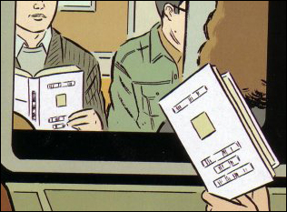
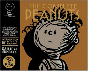
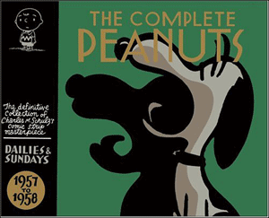
     This thread on the Fantagraphics message board has previews of Canadian cartoonist Seth‘s designs for volumes three and four of ‘The Complete Peanuts.’ Each volume of the hardcover series covers two years worth of strips and will feature a different Peanuts character on the cover. Volumes one and two, released this year, feature Charlie Brown and Lucy respectively. As you can see below, Pigpen and Snoopy have been chosen for next year’s volumes.


     Fantagraphics representative Kim Thompson adds:

     “The final cover will have a different colored logo (like the first two, it will be a variant of the main background color but in a metallic ink, but those don’t show up real well on digital images so we’re sticking with the neutral/tan ones for now), a Snoopy image in the upper left hand corner instead of the repeated Charlie Brown (the upper left hand image repeats the main character), and of course the “INTRODUCTION BY —” copy. But it’s good enough as a spaceholder for Amazon.com.”

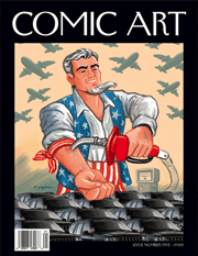
     There is a giant feature on Seth in the latest issue of Comic Art Magazine (AKA the best magazine in the world, ever), which includes some lengthy discussion of the Peanuts designs. I quote liberally from the Comic Art article below, in the hopes that your mind will be blown and you will immediately order a copy of your own.

sethmock.gif

     “These are the covers from the Schulz reprint proposal that I presented to Jeannie Schulz. Basically, Gary [Groth] went through all the dealings and then after they’d got things fairly concrete, where it looked like it was going to happen, they brought me down so I could talk to Jeannie and show her what I wanted to do with the book. I went there with a small talk planned, basically to tell her that I felt Schulz’s work was so wonderfully sophisticated and that it had been, I felt, undersold in the last 30 years-pushed as kids’ books, really Pop-y, and that I wanted to try to put together a package of some sort that had some quality of understatement to it. So, here is the production art that I brought down to sell the idea. These fake covers I put together are pretty rough, really. I outlined how the books would fit together and what the design system was…originally. I was planning on one book per year and I wanted to do 50 covers with Charlie Brown’s face on each one. His face would have been taken from the specific year and then you could chart his changes over 50 years. Basically, everybody but me felt that was too much, that we should vary the characters, which is what will happen. This original idea was to demonstrate how much variety there really was just in the Charlie Brown face itself. Conceptually I like it, but I didn’t really expect them to go for that. So, we’ll have 25 books with all the characters appearing once on the covers-one face per book-although Charlie Brown, Snoopy, and Lucy (maybe Linus too) will reappear-Charlie Brown will defmitely be on the first and the last books. Not all the characters can get the cover-but everyone will make the spine. I’ll start the early volumes with the minor characters, like Shermy. Each cover-featured character will dominate that specific volume’s design.”

     “In many ways, the design has stayed almost exactly the same as I originally conceived it. The endpapers for each are completely assembled from Schulz’s background imagery, which I’ve reworked. I’m keeping the same endpapers for each decade. so it’ll change once we hit the ’60s, and what’s interesting is that by the time we hit the ’90s. there are almost no backgrounds: it’ll become very minimalist. with just a bit of grass, or some detail to build around. When you open the book, I want the reader to move into Schulz’s work in a quiet way, so they start with the environment-then you cross a double-page splash of just grass that will lead you into the book. The grass will be updated every 10 years as well, which no one will even notice but me. That will lead into a series of spreads that go throughout the book before you enter into the strips. Each book will feature one of the iconic places – 25 iconic backgrounds I can work with (Snoopy’s doghouse for example). It’s a pretty straightforward design system, in that with each volume I don’t have a huge amount of elements to change, just certain spreads. I have to replace elements here and there with new imagery from that volume’s years, of course. Things slowly evolve over the whole series. but in a very subtle way, which from book to book really isn’t noticeable, but by the time you get to the last book the changes in the strip and the characters will be very clear.”

     “In the design, what I’m going for-I hope to create a package around the work that shows it in a slightly different context than it’s been presented in for years. I don’t want the reader to think much about it at all, but when they come to it, I hope they’re led in and out of Schulz’s work in a way that puts them in the right mood to read it again as the subtle work that it is, not as the product that has been pushed for so many years by merchandising and TV specials. But, we’ll see. Jeannie Schulz was very receptive and easy-going about things. I was somewhat prepared that if there was any sort of conflict and I felt myself being pulled down the road having to do the same old boring Peanuts books that everyone’s done, I would probably back out of the project. I was happy that she was so open, and what’s great about Jeannie Schulz is that you could really see when talking with her that she thought of Charles Schulz as a genius. You know, when someone’s been married for 30 years (or however long it was), it would be very easy to imagine the widow feeling the exact opposite: sick to death of that irritating husband who spent all his time in the studio complaining about being a sad multi-millionaire. But she didn’t have that quality at all.”

     Now that we’ve got some insight into the theory behind the design, why not take a look at the plan from a marketing standpoint? One of the posters on the Fantagraphics webforum posted the following question:

     “Any indication of how the sales of Complete Peanuts 2 compare to the first? I would imagine this volume will be a better indicator of what the long term sales will be, minus the media frenzy and testing how many people will want to buy a $30 book every six months. I notice that it’s at 178 on Amazon, with the boxed set in the top 500 as well.”

Fantagraphics font of knowledge Kim Thompson responds:

     “It’s hard to do a one-to-one comparison because of the box set. If you count initial sales of Book 2 as an individual title vs. initial sales of Book 1, Book 1 wins. If you count initial sales of Book 2 in all configurations (within or without the box set) Book 2 comes out ahead.”

     “I expect Book 3, which won’t have holiday sales or a box set (and the least popular main Peanut, Pigpen), will dip a bit. Book 4, on the other hand, will have a triple whammy: holiday sales, a box set (most likely), and Snoopy, by far the most popular character, on the cover — as well as being probably the first book where the characters really look entirely like themselves.”

     “Long term, who knows? Volumes 6 through 10 might slow down a bit, but on the other hand the ’60s are the peak period.”

     You may or may not remember that due to the sad state of our nation’s newspaper archives, there were still several ‘missing’ strips from the years covered by the second volume. Fantagraphics representative Kim Thompson keeps us updated on this matter in this thread:

     “[At press time] The only thing missing was a top strip (title panel and first, “breakaway” panel) for one Sunday, and Seth did a minimalist faux one to keep the format consistent. (This is all acknowledged and detailed in the back of the book.) Should the full Sunday ever materialize, subsequent reprintings will include the “real” top strip.”

     “Oddly, 1955-1956 (Vol. 3) has THREE Sunday strips with missing top strips. Well, we have about four months to try to find them.”

     “Very few papers printed the strips at the time, even fewer have decent copies available, and of those that do all the ones we’ve found ran just the bottom 2/3rds. I’ll post the dates here just in case, but trust me, even obsessive PEANUTS collectors have come up snake eyes on ’em so far.”

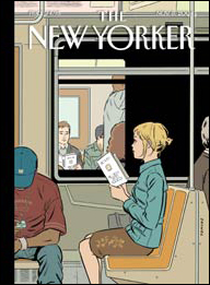
     Fans of Seth’s work should also check out the August 23rd issue of the New Yorker – he did the cover.

sethnycov.gif

Peanut Preserves

     A few years ago, I read ‘Double Fold‘ by Nicholson Baker – an enraging look at libraries destroying back issue newspapers and replacing them with often defective microfiche. In the book, Baker discusses both the alarming frequency at which this is occuring, and the inaccuracy of the science cited as justification (Propigated by microfilm and other such companies). As a result of all this, Baker started a nonprofit organization, rented a warehouse, and went on a crusade to preserve what was left of history’s primary sources – daily newspapers.

     I just found out via this messageboard posting that it was Baker’s collection that enabled Fantagraphics Books to assemble the strips necessary for producing their Complete Peanuts series. The first volume was released this spring, with the second (of 25 total) coming in the fall.

     Despite Baker’s best preservation efforts, however, there are several strips that may well be lost to the sands of time:

     “With PEANUTS 1953-1954 going to press next month, we’re setting our sights on PEANUTS 1955-1956. So far we’ve got all the strips gathered except for three very pesky missing Sundays, which we have only in truncated form (from the Nicholson Baker/Duke collection). If anyone by chance has any of these, let us know.

     These are REALLY obscure. I know PEANUTS completists/experts who apparently haven’t even been able to track down a microfiche version.

     The good thing is that the truncated ones we have were black and white, so they’re cleaner than color ones would be.”

     Those disappointed by Baker’s last novel ‘A Box of Matches’ (Me) can look forward to ‘Checkpoint‘ which is published on August 10th. The premise: Two men discuss an attempted assassination of George W. Bush. Oh man, call O’Reilly! This is gonna be a SHITSTORM of overreaction. His publisher (Knopf) has already released the following:

     “Checkpoint is a work of fiction by acclaimed author Nicholson Baker, a novella that explores the peculiar angst many Americans are feeling right now about their country and their president. The book is set up as a conversation between two old high school buddies. One of them, in despair about the direction the country is going, is convinced he must kill the president; the other tries to talk him out of it.

     Baker wrote Checkpoint in response to the powerless seething fury many Americans felt when President Bush decided to take the nation to war. “How do you react to something that you think is so hideously wrong?” asks Baker. “How do you keep it from driving you nuts? What do you do with your life while this wrong is being carried out? What are the thoughts – the secret thoughts, the unpublishable thoughts, so to speak – that go through your head?”

     Some people have rational responses. Others do not. Baker’s book does not suggest violence is ever an appropriate response. But in order to understand the reasons why a violent act is always a mistake, one must first look at the contemplation of such an act.

The dialogue in Checkpoint is angry, funny, pointed and absurd. All of it has relevance to our world. And it is through the conversation in this novel that Baker hopes to raise important questions about how we react to violence – both individually and as a nation.”

Comic Homage

     The first panel of Sunday, May 23rd’s ‘Mutts’ strip (by Patrick McDonnell) was a subtle homage to Yoshimoto Nara‘s work (inset):

mutts

     The rest of the strip is fairly unremarkable. I just thought that was interesting.

Comic Art Magazine

     I’m currently obsessed with ‘Comic Art Magazine,’ primarily because it’s exactly what I always wanted The Comics Journal to be – historically minded, analytical, and in full color on glossy stock. To be fair, the interviews in Comics Journal are usually pretty great, and the monthly interview mp3’s are a favorite of mine. The editorial quality and production values of Comic Art, however, put the journal to shame.

     My favorite part of the magazine is a regular feature called ‘In the Studio,’ in which comics artists select several pages worth of artifacts from within their personal studios for reproduction. The selections usually include the artist’s originals, favorite bits of random printed matter, and selections from their own collections of original art, each captioned with a description of the item and its importance by the artists. Past installments have covered Daniel Clowes (Eightball, Ghost World), Chris Ware (Jimmy Corrigan, Quimby the Mouse), Charles Burns (Skin Deep, Black Hole, The Believer), and in the current issue, Art Spiegelman (Maus, The New Yorker). Clicking each name in the previous sentance will open a two page preview of the article.

     In addition to these pieces on contemporary comics artists, each issue has featured several articles on comic art of days gone by – including great essays on Charles Schulz’ pre-peanuts work, Disney artist Carl Barks’ unique panel layout (Cool Dude alert!), and the myth that ‘The Yellow Kid’ was the first newspaper comic strip.

     The current issue features an Art Spiegelman cover that was rejected by the New Yorker. From the Spiegelman ‘In the Studio’ article:

     “It was originally presented as a cover for the New Yorker’s “Money Issue” last year, but at that point, [Editor] David Remnick’s repsonse was “This is about oil. It’s a money issue.” (Laughter)….”

comicartcover

     There’s a bit on the circumstances of Spiegelman leaving the New Yorker here, for you comic book gossip hounds.

     The current issue also features an extensive article on ‘Harold and the Purple Crayon’ creator Crockett Johnson’s comic work. The quarterly magazine is 80 pages in full color, with minimal advertising (Even the ads are good, mostly teasers from auction houses selling original artwork). It’s $9 ppd, and the issues have all been selling out, so act fast. You can see the tables of contents of the first 4 issues here.