Updates are at the bottom: update 1, update 2, and update 3. Also: an interview (of sorts) with those responsible for the record.
Sometime last week, I became aware of a new 7″ vinyl release called “Greetings from the World Wide Web,” which appears to be a split release between Detroit band Fawn and eCommerce-centric digital agency Brand Labs. The record was described in the Facebook event invitation for its release thusly:
“Greetings from the World Wide Web is a bold experiment in 21st century consumer outreach protocol by Brand Labs of Rochester, Michigan. By utilizing the Audiosonic Identiglyph (AI), the modern businessperson is no longer limited by the archaic constraints of print and digital media when the time comes to seek out new markets. Using the AI allows the businessperson in question to access as yet unreached customers by promulgating the most critical information about their operation in an easy-to-use, algorithmically encoded audio file that is ready-made for broadcast over the public airwaves – ripe to be captured, decoded and interpreted by any clients within range of the transmission. When you think next level ecommerce, think Brand Labs.”
So yes, encoded audio on vinyl: laser targeted to the confluence of my interests. I’ll bite. With full knowledge that I may well be indulging a wild goose chase dressed up in an attempt to “go viral,” I tracked down a copy via a friend, and have since spent a fair amount of time digesting it.
Before I dive into the nerdy bits, though, I’ll say that the Fawn song is good and you can listen to it here.
The Sleeve
The front cover is decorated with a nicely-executed parade of unlabelled illustrations referencing the high points of internet meme-dom, some more obvious than others. The last one in the second row is my favorite – deceptively understated!

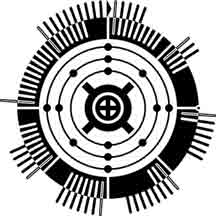
The back cover sports the ‘Audiosonic Identiglyph, surrounded by several paragraphs of purposely stilted-sounding copy. The text claims that the audio on the Brand Labs side of the record is created using the following process:
“Using dual-tone multi-frequency signaling technology and the Goertzel algorithm (s(n) = x(n) + 2cos(2πω)s(n-1) – s(n-2)) our in-house image processing division converts the Identiglyph to a series of tones which are then converted to a single unbroken groove of varying depth, which is subsequently transferred to a vinyl disk that can easily be read by a common phonograph.”
A scan of the back cover is below, clicking it gets a larger file.

Decoding?
While I originally recorded the encoded audio onto my laptop for de-nerding purposes (see below), Brand Labs have since uploaded an MP3 of the encoded “Identiglyph” here. A note about the mp3 – while this comes directly from Brand Labs, the right channel is a solid square wave of noise – not sure if that’s part of the puzzle or an oversight. Either way, I’ve isolated just the left channel as an MP3 below. You can download the file here.

[audio:http://kempa.com/wp/wp-content/uploads/2010/09/brand_labs_audiosonic_identiglyph_LEFT_CHANNEL_ONLY.mp3|titles=Left Channel]
After doing some preliminary googling and wikipediaing, it was clear to me that just as the liner notes had indicated, the audio was indeed a high-speed series of DTMF tones (An example that sounds similar can be found in this youtube video). Despite downloading and experimenting with all manner of DTMF decoders, however, I never found a reliable, reproducable decoding of the audio.
Worried that I might be chasing down a joke, I took to twitter to see if I could wrest any clues out of Brand Labs:
So… that didn’t yield much in the way of new information, and at this point, my “This-is-just-a-dumb-stunt-and-there-is-nothing-encoded” spidey sense was tingling. I tried following up one more time for a hint or at least direct confirmation that there was something to be found:
Hm. I still can’t tell if I’m being toyed with, but prefixing every response with ‘Via Director of Marketing’ tends to instill the opposite of confidence in me.
The next night, I did a bit more meddling with DTMF decoders and then I had to call time on the whole ordeal, as I’ve got other projects that are demanding my attention. If it were simply a DTMF encoding, I would think the Brand Labs folks would be counting on a reasonably simple method of decoding it, but I haven’t yet found one. I still believe there’s something encoded there, and in my experience the best way to figure these kinds of things out is to post them on the internet (Case in point).
My suspicion is that there’s some missing piece to the puzzle in the changing numbers of lines in each section of the outer ring of the ‘Identiglyph,” especially as there is a clearly identified ‘Start’ point.

In the days since I stopped digging, Brand Labs has put up two additional pages here and here, each continuing the pseudo-official tone; and has seemingly issued a press release, which all the copy & paste newswire business blogs have dutifully reposted. I leave this in your hands, internet nerds. Godspeed.
Update!
Lo! Already, the great internet is yielding results! After seeing my plea for help on Twitter, Scott David Herman swiftly deduced that the Identiglyph encodes the latitude and longitude of Brand Labs:
This explains the decimal point on the right, and the inverted black and white of the inner ring could even be meant to reflect the ‘negative’ of the longitude.

Punching the decoded latitude and longitude into Google Maps…

…we get a location in Rochester, Michigan…

…which matches up exactly with Brand Labs’ address! Progress!
But where to next?
9/29/10: Another update!
Two more answers regarding the visual Identiglyph:
1.) My co-worker Karl Tiedemann was the first to posit that the three rings of dots around the central icon represented the atomic configuration of silicon:
2.) Commenter “Lazenby” reinforces the Silicon hypothesis and also adds that the center-most symbol is the astrological symbol for earth:
So… we’ve got the location of a digital agency, Silicon, and Earth. I guess that kind of holds together? Still nothing on the audio front…
10/3/10: The final chapter?
I’ve been away from email all weekend, so there’s tons of stuff pieced together into this update. Let’s start with some refinements to the interpretation of the imagery we’ve arrived at thus far.
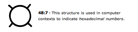
Early on Friday, TheHarmonyGuy noted in the comments to this post that the angular cross / circle shape that surrounds the symbol we had previously identified as representing ‘Earth’ is used in typography to signify ‘Currency:’

Soon after, Sid dug further into the symbols at the center of the glyph, noting that the ‘Earth’ symbol at the center has held many varied meanings, and further pointing out that the ‘Currency sign’ can also denote a Hexadecimal number, which was much more likely to be applicable in this case:
Both the above-mentioned Sid, and another commenter on this post, ASDR, made valiant attempts at decoding the DTMF tones, but ran into very much the same results as I did in my efforts: each DTMF software decoder they attempted to use arrived at different results.
Late on Thursday night, I had posted a question on Ask Metafilter, seeking recommendations for ways in which to attack the DTMF decoding. There, a poster recommended slowing down the recording but maintaining the pitch, so that slow decoders might perform better on the recording. I tried this without any luck and at this point it dawned on me that since resolving a DTMF tone to it’s respective data is heavily dependent on accurately reading the frequencies, any change in pitch could make the recording almost impossible to improperly decode. I compared the MP3 with the original audio I pulled off the vinyl, and noted a noticable difference in pitch, so I was rapodly losing faith in the decodability of the audio.
Late last night, Metafilter user Rhomboid posted his findings to the Ask Metafilter thread. His description of the encoding and how he cracked it is meticulously detailed, based on a string of smart solutions compensating for the frequency inconsistencies. He even shared the source of the custom Perl script he ended up writing to do the decoding.
Decoding the tones with adjusted frequency expectations resulted in 22221 symbols, which were then converted to binary and renamed as a JPG, producing the 216×216 Identiglyph image below:
While there are still some unanswered questions (Earth -> Currency / Hexadecimal -> Silicon -> Brand labs?), I was mostly interested in the encoded audio, so I’m satisfied. I’ve inquired about talking to the team who put this together, so an epilogue to this whole affair may appear at a later date.
In the meantime, a HUGE thanks to everyone who played a role in cracking this: Rhomboid for doing the heaviest lifting in walking the audio all the way through to an image; ‘ADSR’ for spending time further exploring the DTMF angle after I’d given it up; Scott David Herman, Karl Tiedemann, ‘Lazenby,’ Sid, and ‘TheHarmonyGuy‘ for providing bits of the visual Identiglyph Puzzle, and Andy Baio for helping get the word out to the nerds of the internet (The number of seemingly automated Twitter accounts that simply retweet his link feed truly surprised me, though it shouldn’t have – as it has remained the gold standard for so long). Oh, also the internet, for always making any question I post on it get answered, except for in enterprise software support forums. Even the magic of the internet doesn’t work there.
1/2/11: The creators speak (But never break character)
After the dust settled on the decoding excitement, I emailed Brand Labs in an attempt to speak candidly about the project. They agreed to answer any questions I had, but never broke character in doing so. I’ve pasted the full exchange below for the curious.
What were the origins / inspirations of the project?
As we began to dig below the candy-colored surface of today’s social media and digital marketing, we began to see an entirely untapped source of consumer outreach: namely, algorithmically-encoded analog audio. It was so very obvious that we nearly tripped over it. As for our inspiration, we drew from a classic: NASA’s Golden Record from its Voyager missions. It bore the fundamental elements we felt were lacking from current marketing outlets and its mission was simple – tell the audience who you are, what you do and where you may be found. From that inspiration, it was a clear, straight line to our final product. Even the inclusion of popular music as a cultural touchstone for anyone who came upon the artifact (in this case, “Hip Parade” by FAWN) was directly inspired by NASA’s inclusion of Charles Berry’s composition in their project.
Was the intent that the audio would actually be decoded, or was this meant as a “No one will ever do this” exercise in absurdity?
It has always been (and continues to be) our assertion that the public would be able to easily discern our intention, and that they would certainly have a basic understanding of the Goertzel algorithm and dual-tone multi-frequency signaling technology (we did all go to junior high school, after all).
Were you surprised at how quickly the audio was decoded?
We believe the speed with which the audio and the Identiglyph were decoded simply proves our original assertion that the public’s interest and aptitude in amateur cryptography must never be underestimated. In point of fact, had it taken longer we would have been sorely disappointed in mankind in general.
Were you surprised at some of the variance that got introduced, and how involved the decoding got?
A great man once said that one man can never fully know the mind of another. If one accepts that as an ultimate truth (as we do) it follows that a certain amount of unpredictability must be engineered into any given process, as was the case here.
So… “Audiosonic Identiglyph…” …really?
We occasionally and arbitrarily disdain the contemporary trend of assigning “catchy” or “clever” names to items that may be better described in a clear and straightforward manner. In this case, we chose to call a spade a spade.
Encoded audio on vinyl, speaks to a very niche market – was that the target?
Our target is universal and our goal was to ensure the durability of our message. The vinyl “record” offers many durability benefits that digital media does not. As for the encoding element, the simple fact is that languages die (e.g. Esperanto or Canadian) and we’re in this game for the long haul. We intend to be offering online commerce consulting and marketing services long after the English language is nothing more than a quaint memory.
Has everything encoded in the record been properly deciphered? Or are there still a few details we’ve got wrong?
To the best of our knowledge, the lion’s share has been fully decoded with the possible exception of the precise location of D.B. Cooper and the remainder of his ill-gotten gains, however, as that portion of the project wasn’t central to our goal, it would be fair to say that the decoding is complete.
What has the feedback been like so far?
To this point, the feedback has been equal parts amazement, ennui and rabid consumerism, which, in the introduction of any bleeding edge technology, is an entirely predictable result.


